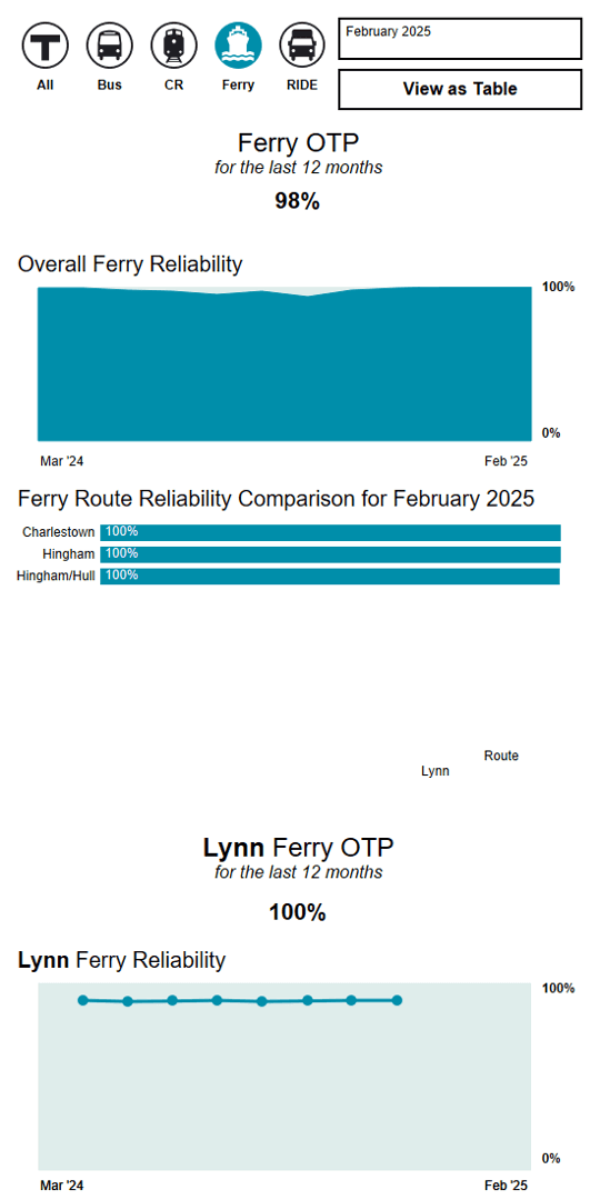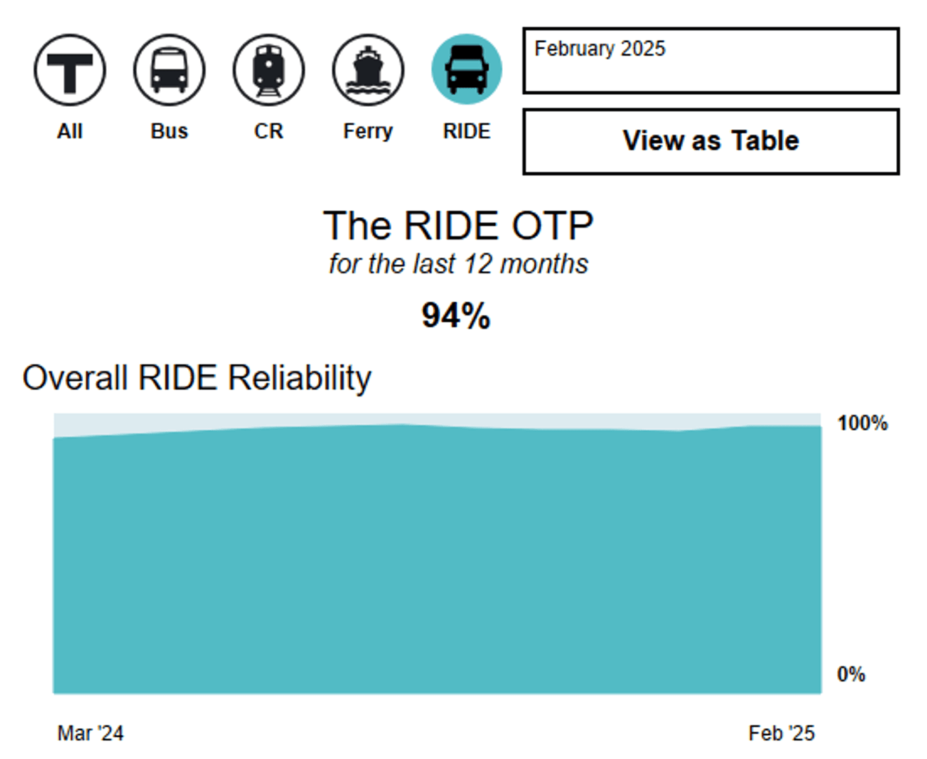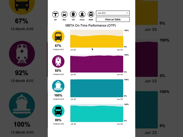
During my co-op with the MBTA’s Office of Performance Management and Innovation (OPMI), I built an interactive On-Time Performance (OTP) dashboard to track and report reliability metrics across non-subway transit modes—bus, commuter rail, ferry, and paratransit. Designed as a public-facing tool slated for eventual rollout on the MBTA reliability page, this was my first real project using Tableau. Working with raw data extracts from the MBTA Open Data Portal, I navigated plenty of trial and error, self-teaching, and iteration to turn complex operational data into an intuitive dashboard for both agency leadership and everyday riders.
What I Did
Learned Tableau on the job from the ground up, navigating complex data structures, calculations, and visual layouts to build a multi-page dashboard tracking reliability across four distinct and unique transit modes.
Pulled and structured raw data extracts directly from the MBTA Open Data Portal to construct the underlying reliability metrics and performance trendlines.
Applied strong visual design and user experience principles to keep the layout clean, approachable, and responsive—helping riders analyze performance without getting lost in dense operational metrics.
Gallery